By Nekrayen and Luppili. Lenin's Young Guard,1920 and poster c1920-23 shows Lenin and Trotsky. Taken from www.tonyscanlonposters.com/russian.php?photo=453.
The reason behind me choosing this poster to represent modernist graphic design, is for two main reasons, the use of the san serifed type face and the photomontage that forms the basis of the Russian revolutionary poster.
By Walter Allner. This was one of a collection of 79 covers for Fortune magazine. Where he was art director from 1962-1974. The reason i chose this piece to represent modernism is because of the use of synthetic colours and the style of print. which shows a progressing from the earliest form of print to modern day. taken from http://30gms.com/tags/C27/P40/
This is an insurances poster created in france, during the first world war 1914. by Filippo Tommaso Marinetti. the reason for me choosing this piece is because of the time it was created soon after the industrial revolution in france. And it is an early example of type being manipulated in size and style on the piece of work, which suggest modernism.
This is a poster created at the bauhaus by Herbert Bayer, in 1926, for kandinsky's 6o th birthday exhibition. The reason for choosing this again, is based around the san serifed type face, which was created at the Bauhaus establishment. Its is a very clean image, but is representative of the style of kandinsky himself, by using type manipulation again. Something that is representative of modernist design.
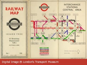
This is an example of Harry Beck's london Underground map, created in 1933.That is so noticeable today. It is a prime example of modernist design. He was one of the first British designers to move away from a fine Art influence. With a definite purpose of instruction on mind. It is a very structured example of modernist design. With again letter manipulation different styles with in words. And it is for this reason i have chosen it.


No comments:
Post a Comment